

 A few weeks ago, we spent the day at the beach. Hubby and I both need vitamin sea to nourish our souls regularly, so we make sure to go a handful of times a year, whatever the weather.
That day was a hot one; perfect beach weather.
While we were lounging at the water’s edge, a young man approached. He dipped his hand in the water, then came back and asked if we could watch his beer and his phone while he went into the water – explaining that he’d told himself he wouldn’t do this, but that the water was warm, so he felt compelled. He told us he was here on tour with his band from South America. We warned him it was a bit chilly a little farther out, but he shrugged that off and went in. When he got about knee-high, he said, “Oh! I see what you mean!”
When he emerged, it was time to decamp a little ways back, with the tide coming in. This spurred a conversation about tides – he explained that when he lived in the Caribbean, there was no tide, but when he moved to South America, suddenly there was tide, and he didn’t know what to make of it. Well, you wouldn’t!
That made me curious, so I came home and read up on the tide. Tides are not just caused by the moon and the sun, but also by the complexity of the coastline, the topography (shape of the land) under the sea, wind, atmospheric pressure, and more. Since we have an especially complex coastline in the UK, we have some of the highest high tides and the lowest low tides in the world.
R. Ray at NASA made this nifty map – deep red shows places with the highest highs and the lowest lows; dark blue shows places with very little tide change.
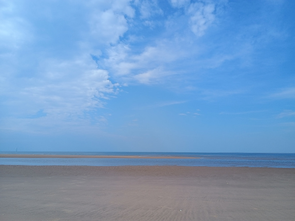
A few weeks ago, we spent the day at the beach. Hubby and I both need vitamin sea to nourish our souls regularly, so we make sure to go a handful of times a year, whatever the weather.
That day was a hot one; perfect beach weather.
While we were lounging at the water’s edge, a young man approached. He dipped his hand in the water, then came back and asked if we could watch his beer and his phone while he went into the water – explaining that he’d told himself he wouldn’t do this, but that the water was warm, so he felt compelled. He told us he was here on tour with his band from South America. We warned him it was a bit chilly a little farther out, but he shrugged that off and went in. When he got about knee-high, he said, “Oh! I see what you mean!”
When he emerged, it was time to decamp a little ways back, with the tide coming in. This spurred a conversation about tides – he explained that when he lived in the Caribbean, there was no tide, but when he moved to South America, suddenly there was tide, and he didn’t know what to make of it. Well, you wouldn’t!
That made me curious, so I came home and read up on the tide. Tides are not just caused by the moon and the sun, but also by the complexity of the coastline, the topography (shape of the land) under the sea, wind, atmospheric pressure, and more. Since we have an especially complex coastline in the UK, we have some of the highest high tides and the lowest low tides in the world.
R. Ray at NASA made this nifty map – deep red shows places with the highest highs and the lowest lows; dark blue shows places with very little tide change. in the Mediterranean, Caribbean, between Japan and China, the south-west coast of Australia, along part of Antarctica, and in various other places. There is deep red (the biggest difference between high tide and low tide) around the UK, Ireland, France, part of Spain, north-east Canada, north-west Australia, west New Zealand, small portions of the south-east Asian coast, southern South America, and other spots. Most of the world's oceans are light blue, green, or yellow, indicating some tidal change but not extreme.")

Saloni Dattani, Fiona Spooner, Hannah Ritchie, and Max Roser (2023) – “Child and Infant Mortality” Published online at OurWorldinData.org. Retrieved from: ‘https://ourworldindata.org/child-mortality’ [Online Resource]

(Chart from same source as above.)
Using your numbers to help make your business better
Do you wish you understood how to use your data to make decisions more confidently?
That's what I'm here to help with.
Hi, I’m Sara-Jayne Slocombe of Amethyst Raccoon. I help your small business thrive using the power of your numbers, empowering you so that you have the confidence and knowledge to run your business profitably and achieve the goals you’re after.
I am a UK-based Data Analyst and Business Insights Consultant, which means I look at your data and turn it into information and insights. I separate the noise from the signal and translate it all into actions that you can actually take in your business.
You're reading my newsletter archive. To be sure you never miss an issue, sign up here:
